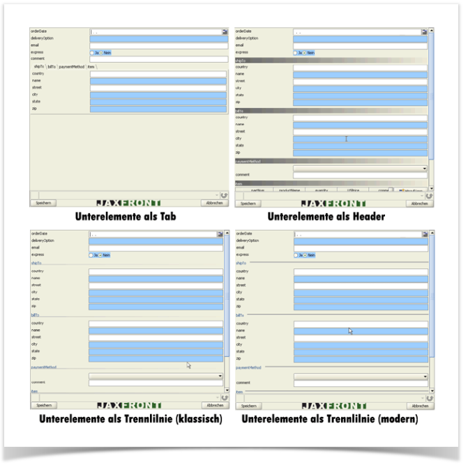
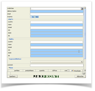
The Children view enables you to define how to represent the direct children of an element (defined in the XML schema). Each child that does not correspond to a leaf may be displayed as
- A separate tab,
- A horizontal bar (header) - or -
- A horizontal line (separator).
Name | Description |
|---|---|
(default) | By default, all sub-components are placed below each other on a panel. At the same time, a border is drawn around each component. |
tab | Sub-components are represented as tabs. |
header | Sub-components are partitioned by a horizontal bar with a color gradient and heading text. |
separator_classic | Sub-components are divided by a horizontal line and the heading text uses the classical look (line below the text). |
separator_modern | Sub-components are divided by a horizontal line and the heading text uses the modern look (line right beside the text). |
Standard view of sub-elements
Different views of sub-elements