The imaginary grid divides the container into several cells. The container can cover several columns and rows. The size of a cell can be adapted to your particular needs, using different strategies.
To produce a new grid, click the push button (number 2, connecting point of column- and row header in the left upper corner of the grid area).
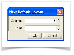
Definition of columns and rows
Fieldname | Description |
|---|---|
Columns | Indication of the number of columns. |
Rows | Indication of the number of rows. |
To indicate different proportions, click on a column (1) or a cell.
Column-/row definition with the cell editor
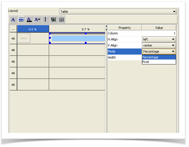
In the Field Mode (2) within the Cell Editor, you can select Pixel or Percentage :
Field Mode | Description |
|---|---|
Pixel If the indication of pixel is set to 0, then the row height, respectively the column width, | Defines the width/height in number of pixels. |
Percentage | Defines the width/height in per cent. |
Initially, the size of a container is divided between the columns and rows, which were defined as „Pixel" and/or as „preferredSize". Then, the remaining surface is assigned to the scalable („Percentage") columns and rows. If the sum of the scalable columns and/or rows is less than 100%, the remainder is distributed to the columns and rows that were defined as „fill".
The horizontal and vertical alignment of a column, and then a row, can be defined in the „H.Align" and „V.Align" fields.
Mode | Description |
|---|---|
default | Standard setting: left (horizontal), center (vertical). |
fill | Fills the entire cell. |
center | Centers the component within a cell. |
top | Sets the component to the top border of a cell. |
bottom | Sets the component to the lower border of a cell. |
left | Aligns the component to the left border of the cell. |
Right | Aligns the component to the right border of the cell. |