The global settings apply to the entire Graphic User Interface. They are defined in the following screens:

The settings are divided into different categories:
- General
- Style
- Label
- Component
- Choice & enumerations
- Caption
- Editor Panel
- Navigation tree
- Error display
Field name | Default | Description |
|
|
|---|---|---|---|---|
General |
|
|
|
|
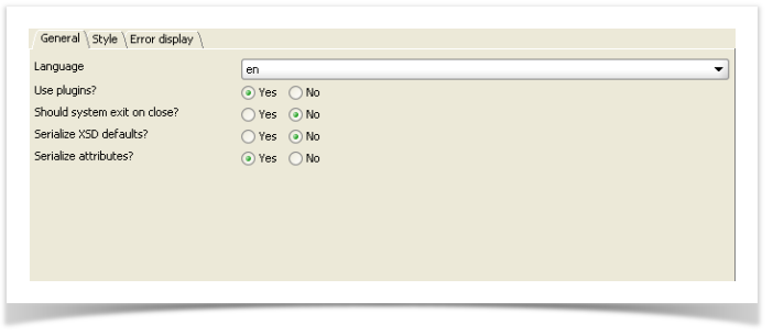
Language | en | Defines the language to be used. |
|
|
Use plugins? | Yes | Defines whether JavaBeans can be used as a plug-in class. |
|
|
Should system exit on close? | No | Defines whether the application is to be closed when the object editor is closed. |
|
|
Serialize XSD defaults? | No | Defines if the xsd defaults (for primitive types) should be serialized. |
|
|
Serialize attributes? | Yes | Defines if the xsd attributes should be serialized. |
|
|
|
|
|
|
|
Style |
|
|
|
|
Is GUI editable? | Yes | Defines whether the document is editable or not. |
|
|
Screen size (in pixel) | 800*600 | Defines the standard screen size. |
|
|
Divider location | 0.2 | Defines the position of the split-bar, either in pixels (> 1) or percents (< 1.0). |
|
|
Top indent (px) | 2 | Defines the top indent for the entire workspace. The setting is expressed in pixels. |
|
|
Bottom indent (px) | 2 | Defines the button indent for the entire workspace. The setting is expressed in pixels. |
|
|
Left indent (px) | 2 | Defines the left indent for the entire workspace. The setting is expressed in pixels. |
|
|
Right indent (px) | 2 | Defines the right indent for the entire workspace. The setting is expressed in pixels. |
|
|
Nested indent (px) | 0 | Defines the indent from the left border. The indent increases with each increasing nesting level. The indent can be set in pixels only. |
|
|
Horizontal scrollbar policy | asNeeded | Defines the horizontal scrollbar behavior. |
|
|
Vertical scrollbar policy | asNeeded | Defines the vertical scrollbar behavior. |
|
|
|
|
|
|
|
Style - Label |
|
|
|
|
Width in percent or pixel | 0.3 | The width of the component label. The setting is expressed in pixels or percents. |
|
|
Indent (in pixel, from left) | 2 | Defines the indent from the left border, for the label of a component. The setting is expressed in pixels. |
|
|
|
|
|
|
|
Width in percent or pixel | 0.7 | The component width. The setting is expressed in pixels or percents. The Width setting makes sense only in combination with the label. |
|
|
Indent (in pixel, from left) | 0 | Defines the left indent for the component. The setting is expressed in pixels. |
|
|
Top indent (px) | 1 | Defines the top margin for the component. |
|
|
Bottom space indent (px) | 1 | Defines the bottom margin for the component. |
|
|
Show attributes? | Yes | Defines whether attributes will be displayed |
|
|
Show fixed leaf values? | Yes | Defines, if elements, for which a fixed value was assigned in the XML schema, are displayed or not. |
|
|
Use optional check box? | No | Defines whether optional data elements can be displayed or removed via checkbox. |
|
|
Optional field color (r,g,b) | 255,255,255 | Defines the background color of the optional fields. Standard: white. |
|
|
Required field color (r,g,b) | 255,225,204 | Determines the background color of components, for which a value must be entered. This is a mandatory field, according to XML schema. Standard: light blue. |
|
|
Application required color (r,g,b) | 155,100,255 | Determines the background color of components, for which a value must be entered. This is a mandatory field, in accordance with XUI definition. Standard: violet. |
|
|
No. of visible list items | 5 | Defines the number of visible list items within a table. |
|
|
Boolean visualizer | radiobutton | Defines how primitive Boolean types (Yes/No) are displayed. |
|
|
Boolean button sequence | yes, no | Defines the sequence of Yes/No radio buttons. |
|
|
|
|
|
|
|
Visualizer | combobox | Defines how the choice components are displayed, as a combo box or radio-buttons. |
|
|
Orientation | horiz. | Defines the orientation (horizontal or vertical) of the choice components, if these are displayed as radio buttons. |
|
|
Enumeration Visualizer | combobox | Defines, how the enumerations components are displayed (as a combo box or radio buttons). |
|
|
Enumeration Orientation | horiz. | Defines the orientation (horizontal or vertical) of the enumerations components, if they are displayed as radio buttons. |
|
|
No reset if choice made? | No | Defines whether after a successful selection of an optional choice the empty selection no longer appears. If this option is activated, the successful (done) selection is serialized in any case. |
|
|
|
|
|
|
|
Type | border | Defines the kind of heading to be displayed (frame, title, dividing lines). |
|
|
Indent (in pixel, from left) | 0 | Defines the indent from the left border for the component heading (frame, title, dividing lines). |
|
|
Apply indent on |
| Define if the nested indent should apply for the label, component only or both. |
|
|
|
|
|
|
|
Top indent (in pixel) | 0 | Defines the upper distance to the preceding visual component. This setting is expressed in pixels. |
|
|
Inner bottom indent (in pixel) | 0 | Defines the distance from the last component within the border to the actual border. This setting is expressed in pixels. |
|
|
Outer bottom indent (in pixel) | 0 | Defines the distance from the bottom border to the next visual component. with optional borders. This setting is expressed in pixels. |
|
|
Show optional border control? | Yes | Defines whether the arrow for the unfolding and folding is displayed with optional borders. |
|
|
Collapse control by default? | No | Defines if the optional border control should be collapsed by default. |
|
|
|
|
|
|
|
Top indent (in pixel) | 0 | Defines the upper distance from the dividing line to the preceding visual component. This setting is expressed in pixels. |
|
|
Bottom indent (in pixel) | 0 | Defines the lower distance from the dividing line to the first visual component within this section. This setting is expressed in pixels. |
|
|
Start color (r,g,b) | 44,73,135 | Defines the starting color of the verlauf for a title. |
|
|
End color (r,g,b) | -1, | Defines the final color of the Verlauf for a title. |
|
|
Text color | 255,255,255 | Defines the title color. |
|
|
Make tree entry as default? | No | Defines whether all elements, for which a header caption was defined, automatically receive a tree entry. |
|
|
|
|
|
|
|
Top indent (in pixel) | 0 | Defines the upper distance to the preceding visual component. This setting is expressed in pixels. |
|
|
Bottom indent (in pixel) | 0 | Defines the lower distance to the next visual component. This setting is expressed in pixels. |
|
|
Style-Caption-Separator (Modern) |
|
|
|
|
Top indent (in pixel) | 0 | Defines the upper distance to the preceding visual component. This setting is expressed in pixels. |
|
|
Bottom indent (in pixel) |
|
| 0 | Defines the lower distance to the next visual component. This setting is expressed in pixels. |
|
|
|
|
|
Top indent (in pixel) | 0 | Defines the upper distance to the preceding visual component, in pixels. |
|
|
Bottom indent (in pixel) | 0 | Defines the lower distance to the next visual component. This setting is expressed in pixels. |
|
|
|
|
|
|
|
Show status bar? | Yes | Defines whether a status bar is displayed, to show error messages. |
|
|
Show button bar? | Yes | Defines whether a button bar is used, containing the standard buttons „Save" and „Cancel". |
|
|
Show forward button? | No | Enables the forward navigation to the next node within the navigation tree. One can navigate through navigation buttons or by pressing the F8 key. |
|
|
Show backward button? | No | Enables the backward navigation to the next node within the navigation tree. One can navigate through navigation buttons or by pressing the F7 key. |
|
|
|
|
|
|
|
Visible? | Yes | Defines if the navigation tree should be displayed. |
|
|
Root node (xpath) |
| Designates any node of the tree as the root. The statement is done with an XPath expression and must address at least one node. |
|
|
Selected node (xpath) |
| Displays the contents of the selected node in the workspace. The statement is done with an XPath expression and must address at least one node. |
|
|
Show container item for list? | Yes | For lists, defines whether an intermediate element in the tree is displayed, summarizing all the list entries. |
|
|
Ending for list tree items | (s) | Defines the ending for the list container. |
|
|
Show help panel? | No | Defines whether a Help page should be displayed in the north where the XML Schema annotation text of the selected tree netry will be displayed. |
|
|
Use navigation keys (up,down)? | Yes | Defines whether the navigation keys (F7, F8, cursor Up & Down) are active. |
|
|
|
|
|
|
|
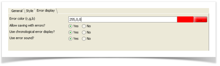
Error color (r,g,b) | 255,0, | Defines the color for error messages. |
|
|
Allow save with errors? | Yes | Defines whether an XML instance may be saved if errors are detected. |
|
|
Use chronological error display? | Yes | Allows the display of the error messages chronologically (true) or in the order of the node definition from the XML schema (false). |
|
|
Use error sound? | Yes | Enables a beep tone if, for example, an error was validated during the input. |
|
|