Fieldname | Default | Description |
|---|---|---|
Visible | Yes | Defines whether the component is indicated or not. |
Column width in pixel (<1) or % (>1) |
| Defines the width of the component in per cent (if value is less than 1) or in absolute pixels. Default comes from global settings (Style-Component) 0.7 |
Indent |
| Defines the distance from the right margin of the component (indent) in pixels. |
Size | -1.0 | Defines the size in pixel of this component. |
Multiline | 1 | Defines whether and how many lines of a string type are to be displayed. If more than one line is defined, a TextArea with the number of defined lines is displayed. |
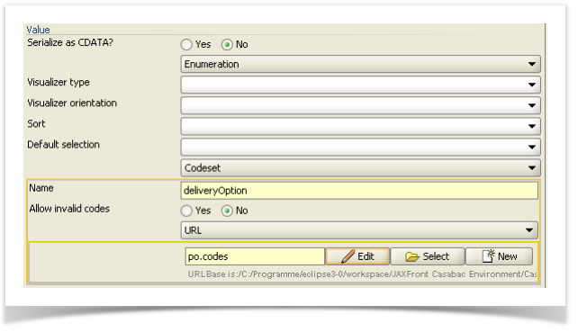
Value |
| Defines the kind of the input field (simple value or enumeration, see below). |
Single Value |
| Pre-defined value of this component. |
Example: Indent with a label and component
Settings for the type of value

