Fieldname | Default | Description |
|---|---|---|
Visible | Yes | Defines whether the component is indicated or not. |
Column width in pixel (<1) or % (>1) |
| Defines the width of the component in per cent (if value is less than 1) or in absolute pixels. Default comes from global settings (Style-Component) 0.7 |
Indent |
| Defines the distance from the right margin of the component (indent) in pixels. |
Size | -1.0 | Defines the size in pixel of this component. |
Multiline | 1 | Defines whether and how many lines of a string type are to be displayed. If more than one line is defined, a TextArea with the number of defined lines is displayed. |
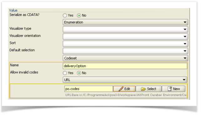
Value |
| Defines the kind of the input field (simple value or enumeration, see below). |
Single Value |
| Pre-defined value of this component. |
Figure 60: Example: Indent with a label and component
| Hinweis |
|---|
| The example above shows an indent of 10 pixels on the label, respectively 30 pixels for the component. In addition, an icon was defined for the label. The icon is displayed above the label. The input field for the „deliveryOption" was set to three (3) lines (number of lines). |
...
Figure 61: Settings for the type of value


